Your team can see the turnover clock from across the room. So can the surgeon.
OR Tempo lives on an iPad in the room. Every phase of the case is one tap. Every number is shared. The whole team plays the same game.

Built around the way the room already thinks.
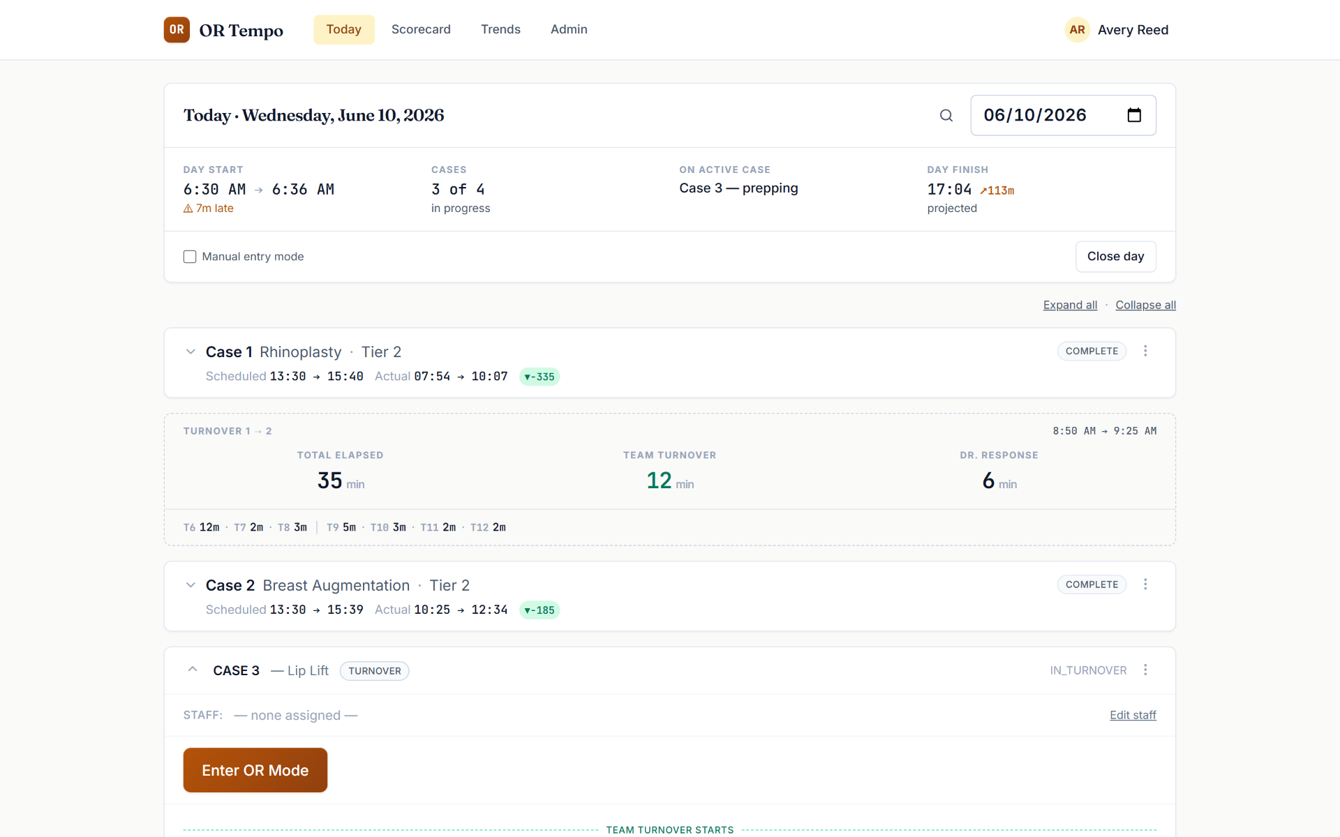
The whole day on one board.
Scheduled vs. actual for every case, live status, and turnover summaries between cases as first-class rows — Total Elapsed, Team Turnover, Surgeon Response, each rated against your own standards. One glance tells the team where the day stands.
Thirteen taps. Zero retraining.
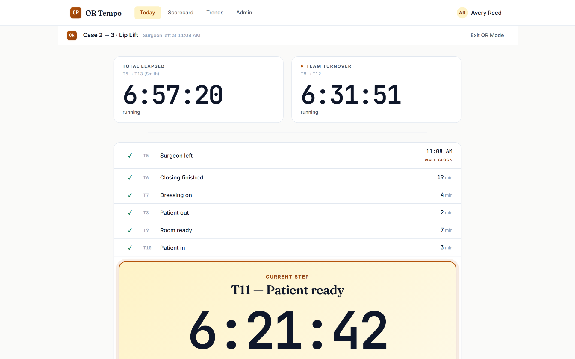
OR teams already think in the steps of the paper timing sheet — patient in, surgeon in, closing, patient out. OR Tempo speaks that exact language: thirteen tap-points (T1–T13) that take seconds to capture. The iPad in the room records the taps; the manager's laptop sees them live.
Visible work is defensible work.
Most timing tools feel like surveillance. OR Tempo is the opposite: it's your team's proof. When someone asks why a room took forty minutes, the team has the phase-by-phase answer — where the time actually went, and what was out of their hands. And because the clock is visible, the team always has a number to beat. Turnover stops being a criticism and becomes a game the room wants to win.
Ask any administrator what staff say about being timed. Then ask a team that runs OR Tempo.
Fast is slow · Smooth is fast
Numbers honest enough to act on.
A scorecard, not a vanity dashboard.
Every day gets rated — Team Turnover, Total Elapsed, Surgeon Response, Late Start — green, yellow, or red against standards you set. Yellow and red are honest; that's the point.
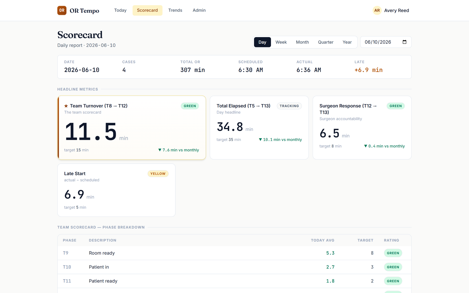
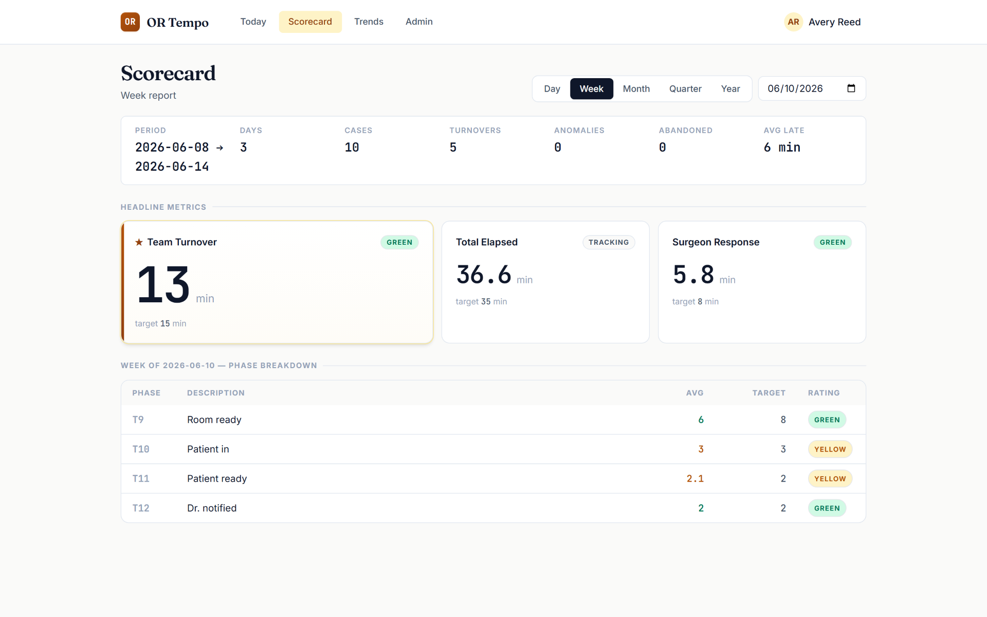
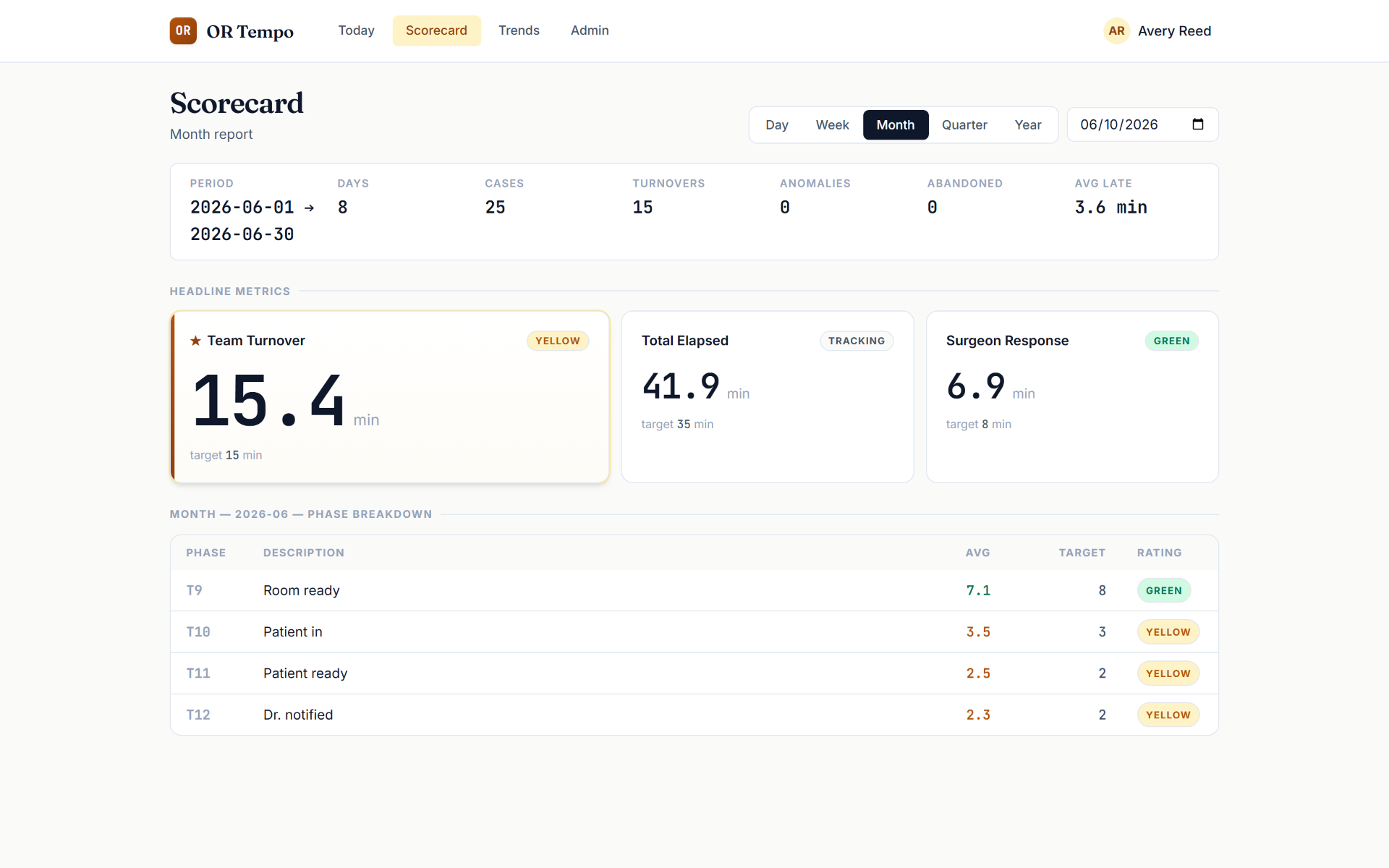
The same three headlines aggregate across week, month, quarter, and year with deltas vs. the prior window — what an owner reads on Monday morning.
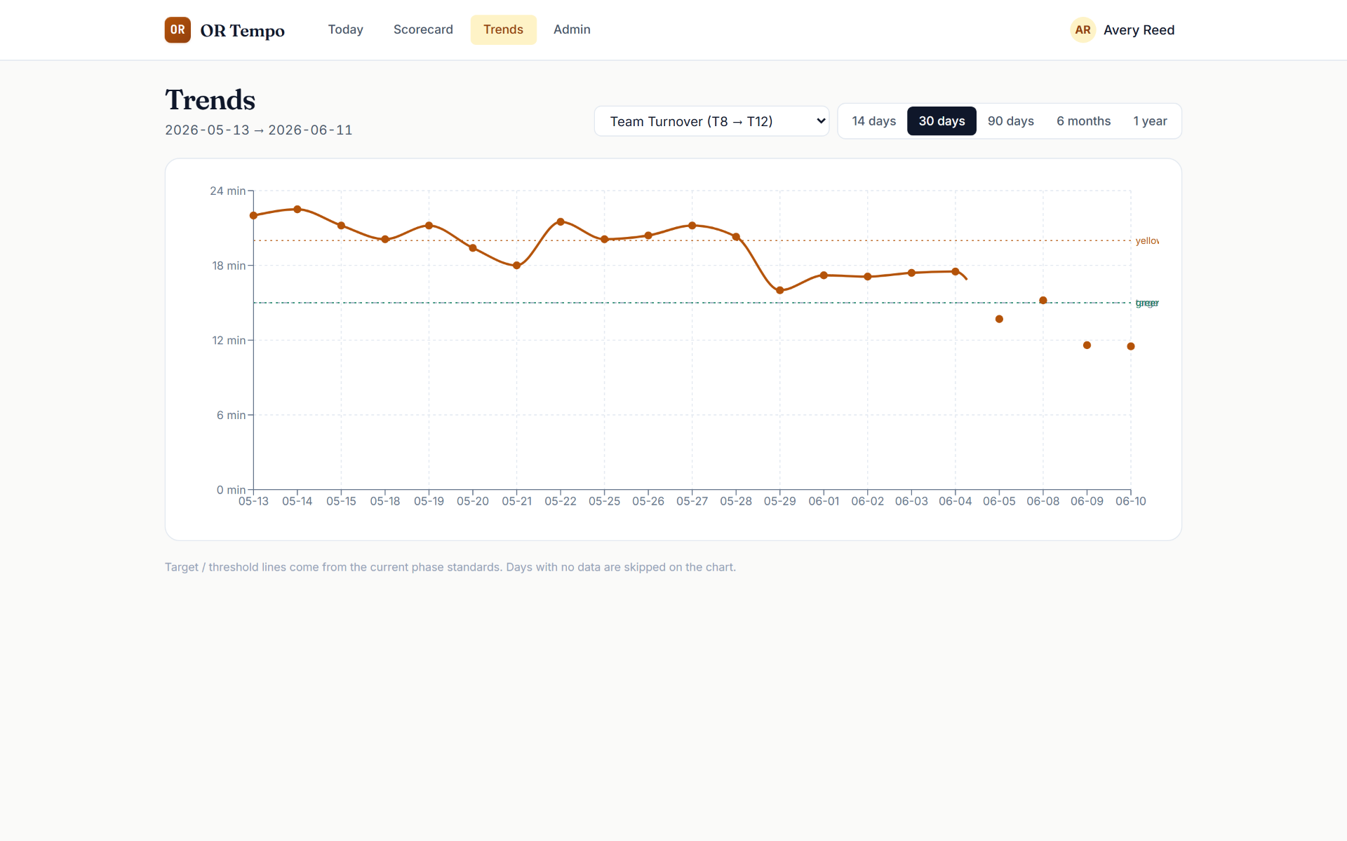
Prove the improvement.
The trend chart draws your target and threshold lines right on the data. When turnover drops from 26 minutes to 14 over a month, you don't claim it — you show it.
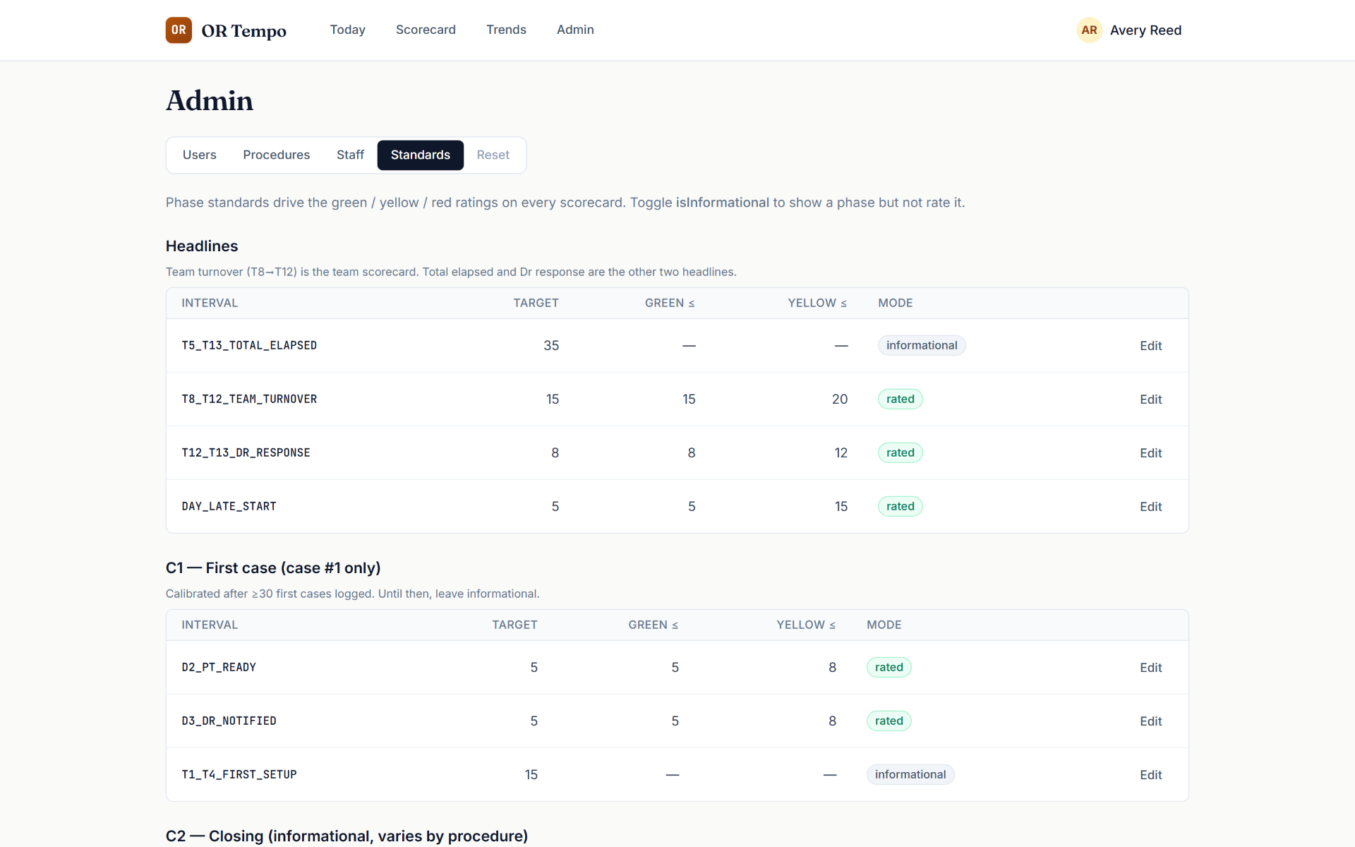
Standards that meet your reality.
Every phase has a tunable target and thresholds. As your data accumulates, you tighten the standards. The tool adapts to your facility, not the other way around.
Light on compliance, by design.
OR Tempo tracks minutes, not medical records. No patient health information is required — case identifiers are optional free-text references that are opaque to the system. That means no months-long security review standing between your facility and better turnover data.
Every administrative access is recorded in a queryable audit log.
Predicted case lengths, predicted day end.
Every tap is a data point. OR Tempo learns how long each surgeon's cataract, YAG, and injection actually take in your rooms — and uses that history to predict each case length and the time the schedule will end. The longer you run it, the sharper the prediction.
- Case 1 · Cataract07:30 → 07:54
- Turnover07:54 → 08:08
- Case 2 · YAG + Inj08:08 → 08:41
- Turnover08:41 → 08:54
- Case 3 · Cataract08:54 → 09:19
On current pace the OR finishes than the paper schedule. Updated after every tap.
- →Surgeons see a realistic finish time, not the paper one.
- →Schedulers stop over- or under-booking the same surgeon week after week.
- →Staff know when the day is actually going to wrap.
- The prediction is your own data reflected back. No vendor benchmarks, no borrowed averages — just how your team actually runs.